Tuesday, October 30, 2012

Visual Thinking Research


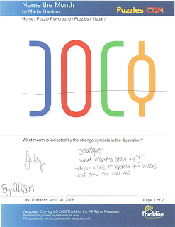
The first puzzle I chose from the list was "Name the Month."  The directions for this puzzle were: "What month is indicated by the strange symbols in the illustration?"  I worked on this assignment with my roommate, Kelly.


This is Kelly's paper.  The strategies she used were: 1.  went through all of the months, 2.  looked for the months with four letters, and 3.  found the months that started with the letter J.


This is my paper.  One strategy that I used was I covered up the top portion of the illustration with my hand (I drew a line on the paper to represent what I hid with my hand).  Once I covered up the top portion, I was able to see clearly the illustration said "July."  The McKim operation that I think is the closest to this strategy is "Finding."  Finding requires you to decide whether or not a figure is concealed in a drawing or number of drawings.


The second puzzle I chose from the list was "The Cat."  The directions were: "How many different triangles can you count in the picture of the cat?"  I did this puzzle with my roommate, Kelly.


 This is Kelly's paper.  The strategy she used was to count all of the individual triangles.


This is my paper.  The strategy that I used was to count each individual triangle one by one.  I first numbered the triangles and then went back and circled them to make sure I counted correctly.  The McKim operation that I used was "Grouping."  Grouping allows you to focus on one common shape and find al of the shapes that match that common shape.


Fact:  We (Kelly and I) actually counted 21 triangles, while the answer on the answer sheet was 20.  We found a triangle that they did not find.


Puzzles from:
http://www.puzzles.com/PuzzlePlayground/Visual.htm

Thursday, October 18, 2012

Feature Hierarchy


This is a movie poster for Walt Disney Pictures’ “The Little Mermaid,” which debuted in theaters in 1998.  At first, my eyes are drawn to the bright yellow color of the movie title on the bottom of the poster.  Color is the first level of the preattentive feature hierarchy that my eyes are drawn to.  My eyes are also drawn to the center of the poster.  Ariel, the main character of the movie, is placed in the center of the poster, right above the title of the movie.  She is almost in a silhouette form, though I can see shades of red in her hair and green in her mermaid tail.  My eyes are constantly going back and forth between the mermaid figure and the movie title because those are the features of the poster that stand out when my eyes first see this poster.  Spatial grouping is also an important preattentive feature.  I like how this poster is simple and only shows the main character in an almost silhouette portrayal.  I have seen other movie posters for this specific movie and most of them are to busy-looking:  many include all of the characters in the movie packed onto the poster that it looks to clumped and clustered.  This poster is simple to look at and helps your eyes to only focus on the important things, like the character and the movie title.

Picture Works Cited:
http://disneyanimation.webs.com/apps/photos/photo?photoid=131310243


Wednesday, October 10, 2012

Top-Down Visual Processing


Every time I visit Disneyland or Disney World, I walk through the park entrance and find these vintage ride posters.  They are plastered throughout the tunnels guiding you towards Main Street.  This particular poster is for the Alice in Wonderland ride in Fantasyland.  At first, your eyes are fixated, trying to look at all of the images on the poster.  Once you realize that all of the images are connected, the information your eyes take in travels to your brain and you begin to connect the images with things you may see while in the ride.  These longer fixations allow your brain to connect the images and the words, and then put them together.  The path your eyes follow is known as a scan path or eye path.  Your eyes go back and forth between all of the images on the poster, and the words compliment the images because they give more information about the ride and what you will be experiencing.  Your eyes make sure you see all of the images, since they are telling you the story behind the Alice in Wonderland ride (there’s the Cheshire Cat, Caterpillar, White Rabbit, etc.).  This process is goal-directed because your eyes are constantly scanning the poster and linking the images with actual concepts in the ride.  The overall process is known as Top-Down Visual Processing, goal-biased attentional looking.  This poster grabs your attention through its images, which your eyes take in and send to your brain to deliver the message.

Picture Works Cited:
http://lisamakes.wordpress.com/2008/07/04/the-wonderful-world-of-disneyland-posters/

Thursday, October 4, 2012

Blog Exercise: Success/Failure of Syntactical Guidelines


This is a vintage Disneyland ride poster, depicting the Matterhorn Bobsleds ride.  This piece of graphic art is a great example of the correct usage of the Syntactical Guidelines.  First, the equilibrium of this poster is perfect: everything is centered and balanced.  The ride vehicles are centered on the page (they are the main focus of the ride).  Even though the vehicles are tilted, the design of the poster as a whole is balanced.  Second, this poster shows a lot of stress incorporated in it.  The curves of the ride track and the ride vehicles themselves are perfectly even (the vehicles are curved in a way that flows with the track).  There are also many “triangles” on this poster  (in the lecture, there was a lot of emphasis put on stress, triangles, and angles).  Third, sharpening in this poster is greatly defined.  The ride vehicles are in color, while the background and Matterhorn Mountain are in shades of blues and grays.  With the ride vehicles in color, our eyes are focused on them rather than the background.  Lastly, our eyes are attracted to the vehicles, which is the main point of the ride.

Picture Works Cited:


This is a movie poster for the Disney film, “John Carter.”  I chose this poster as a failed attempt at including the Syntactical Guidelines.  As a viewer, this poster does not impress me.  One guideline that this poster did not emphasis was sharpening.  The font color does not allow the title of the movie to shine.  The title blends into the background, making it hard to see the letters.  One thing that this poster did well was sharpening the main character of the movie, but the title should’ve been sharpened more because that is what the audience will read.  Another reason why I do not like this poster is the outline or curved line of a planet or the sun (I am not sure what it is supposed to be).   This line makes the poster look unbalanced.  I am not a fan of this poster. 

Picture Works Cited: