Tuesday, December 18, 2012

Visual Techniques


Visual Techniques:
-Asymmetry
-Simplicity
-Activeness
-Accuracy
-Flatness
-Sharpness


Visual Techniques:
-Complexity
-Exaggeration
-Activeness
-Boldness
-Accuracy
-Depth


The Results Between the Two Design Works:

The first picture is a vintage Disneyland poster for the “Autopia” ride, and the second picture is a poster for the CBS television show, Hawaii Five-0.  The “Autopia” poster is designed differently than the Hawaii Five-0 poster.  With the “Autopia” poster, the design has more flatness than the other poster.  I can tell the “Autopia” poster is more flat because of the lines and shapes used; the Hawaii Five-0 poster has more depth because there are actually real people in the poster layout and the water splashing around those people creates more depth.  Both of these posters give a visual message describing what either the ride or the television show will entail.  The “Autopia” poster tells audiences that you will embark on a ride that involves cars, roads, and curves.  You can tell this because of the curved lines and overpass in the poster design.  The Hawaii Five-0 poster shows audiences the four main characters of the show and you can infer that the show takes place somewhere with ocean water because there is water splashing around the characters.  The Disneyland vintage poster shows how simple a design can be but still gets a message across to an audience.  The simplicity of this design has a great impact on audiences because the message comes across straight to the point.  The Hawaii Five-0 poster design is more complex and involves a great deal more depth and activity than the Disneyland poster.  This design creates realness and is more life-like than the Disneyland poster.


Picture Works Cited:

http://www.amazfacts.com/2011/07/vintage-disneyland-posters-42-pics.html

http://www.tvblog.ro/hawaii-five-o-sezonul-1-poster/


Wednesday, December 12, 2012

Contrast


Good Use of Contrast:
This is a poster for the television show, Mad Men.  This poster is a great example of good use of contrast.  The usage of only three colors (red, black, and white) allow a clear message to be conveyed.  These colors "pop out" perfectly on this poster.  The silhouettes of the characters and the way they are portrayed with the colors is perfectly designed.  This poster is easily readable because only three colors are used, and those colors are the most recognizable and commonly used in advertisements to draw attention.  With the usage of black and white for the background, the title of the show is able to stand out, just like the characters stand out.  This poster is simple yet the usage of black, white, and red makes for an excellent poster design.

Picture Works Cited:
http://en.paperblog.com/mad-men-poster-high-contrast-adaptation-176686/


Bad Use of Contrast/Contrast Failure:
This is a scientific poster, but you can barely tell what it says let alone know that it is a scientific poster. The only way that I know it is a scientific poster is because the website told me so.  This poster is not designed well according to contrast.  The designer used all dark font colors and backgrounds, which makes the poster hard to read.  There is low contrast in this poster due to the bad usage of color.  The tones are all wrong and the color choices create a headache for people trying to read what the poster says.  This would be a more effective poster if the designer had used either a dark background with light font colors or a light background with dark font colors.  Overall, this poster is a contrast failure.

Picture Works Cited:
http://www.makesigns.com/tutorials/poster-design-layout.aspx

Thursday, December 6, 2012

Movement/Motion


This is the movie poster for the Disney/Pixar film, Up.  I chose this poster because it displays motion that is clearly visible.  This movie is about an older gentleman who wants to go on one final adventure, so he rigs balloons to his house and floats away.  In this poster, you can see his house in the background, which is the start of the motion and movement.  Attached to the house is a garden hose with Dug, Russell, and Mr. Fredrickson.  These three characters are hanging on for dear life as the house floats above them.  You can see the motion and movement because they are flying through the clouds, as the house floats higher and higher.  You can also tell that there is movement in this poster because the characters look like they are falling down in our direction.  The motion in this poster is implied motion, which is clearly and creatively displayed.


Picture Works Cited:
http://www.movieposterdb.com/movie/1049413/Up.html


This is a movie poster for the Disney film, Tangled.  There are many parts of this poster where you can see an implied motion or movement.  The first is the lanterns floating up into the night sky.  These lanterns start from one common source and then as they float into the sky, they disperse across the top of the poster.  The second part of the poster that shows motion and movement is Rapunzel's hair.  Her long, flowing, blonde hair cascades behind her in a spiraling motion.  It seems to float through the air.  The third part of the poster where you can see motion and movement is the boat in the water.  If you look at the bottom of the boat, there is water that splashes around it.  The splashing water indicates the boat is moving forward.  


Picture Works Cited:
http://www.shockya.com/news/2010/11/11/a-new-tangled-movie-poster/

Wednesday, November 28, 2012

Dimension/Depth/Space/Scale


This is a poster for the Disney and Tim Burton film, Alice in Wonderland.  Dimension, depth, space, and scale all relate in some way in this poster.  One depth cue that I see within this poster is Overlapping.  The mushrooms are placed in front of each other, with the taller ones in the back to middle and the smaller ones on either side of the bigger ones.  This gives an effect of depth.  Another cue in this poster is Scale.  Scale applies to physical objects in space, depth perception, and graphic depictions of size.  In real life, humans are taller than mushrooms, a lot taller.  But in fantasy, reality can fly out the window.  Mushrooms can be taller than humans, and quite frankly, I'm not sure if the Mad Hatter is really human or not.  That is what's great about fantasy.  You are free to let your imagination do the talking.  This is one reason why I chose this movie poster.  Scale is a major factor in this movie, and this poster gives a great inference into what you can expect to see when you watch this movie.

Picture Works Cited:
http://rookieinlive.wordpress.com/2010/03/18/alice-in-wonderland-–-3d-movie-review/

Thursday, November 15, 2012

Tone and Color

This is a poster for the ABC television show, Once Upon a Time.

How TONE is Operating:
The tonal range in this poster is important in the way that the picture communicates with its intended audience.  In this poster, tone creates mood.  The darkness and the shadows indicate a sort of eeriness and suspense, two ideas that are prevalent in this television series. 


How TONE is Interacting:
The element that tone interacts with is the Line.  There is a wide variety in the tonal range used on the trees in the background of this poster.  The trees are perfectly or almost perfectly straight (they are the lines in this poster).  The trees in the forefront of the poster have a different tone to them than the trees further in the back.


How COLOR is Operating:
In this poster, there is little color variety.  Although this show has amazingly beautiful costumes full of color, this poster portrays those costumes in black and white.  The only color in this poster is the title of the show in gold.  Everything else is kept to black, white, or darker shades of black/blue.  The use of gold for the title gives this poster the Pop-Out Effect.  Also, the Natural Color System is used in this poster (black and white).


How COLOR is Interacting:
The element that color interacts with is Shape.  The main characters of this television series are the shapes portrayed in this poster.  Even though people aren't square shaped or circle shaped, I still consider people to be shapes.  There are some shapes that are visible in this poster through those people.  The evil queen's (second from the left) costume (her shoulders to her waist) give the outline of a triangle.  The heads of every character are circle shaped.  The characters are portrayed in darker and lighter shades of black and white, giving the title of the show the most color.  This is how color interacts with shape.


Picture Works Cited:
http://www.cinemablend.com/television/Once-Time-SDCC-Poster-Teases-Season-2-44244.html

Thursday, November 8, 2012

Basic Elements in Works of Visual Communication Design

Visual Communication Design:


Lines
The first element that came to mind when I saw this vintage magazine ad was lines.  There are many lines in this advertisement.  These lines include the shape of the Wrigley gum box, the lines in the font of the writing and letters, the lines of the advertisement itself, etc.  For example, the lines in the font of the letters are defined and differentiated.  The outline of the letters are straight and direct lines, not curved ones.  The typography is very sleek and precise.  The job of the lines in this advertisement is to convey a clean font so that the letters are easily readable.  


Shapes
This is a picture of a Microsoft Tag, one of the new designs of a QR code.  The element that came to mind when I saw this piece of advertising was shapes.  In this box, there are triangles, rectangles, and parallelograms.  These shapes are important in the design of each new QR code because they are a code for something.  When you scan this box, you are taken to a website for a particular product or service.  With the use of shapes, Microsoft is able to design hundreds of different codes to different websites.  The combinations of shapes are endless.  


Scale
This is a vintage Disneyland poster advertising some of the attractions you may find in the park.  The element that I saw in this advertisement was scale.  Scale is a visual measuring tool and communicates actual scale and relative proportion of different objects to each other.  In this ad, most of the objects are in perfect scale and are the correct size.  The mountain in the background is proportional to the monorail next to it.  In the front of the advertisement, the mermaids are a bit out of scale.  I believe the submarine should have been a bit larger and the mermaids a bit smaller.  But, I do understand why the mermaids were created larger:  They are one of the focal points of the poster and are placed right in the front of the poster.  Overall, the objects placed on this poster are to scale, and do not look like they were created too big or too small.


Picture Works Cited:

http://www.smashingmagazine.com/2008/04/21/celebration-of-vintage-and-retro-design/

http://alessandrarlima.blogspot.com/  

http://www.amazfacts.com/2011/07/vintage-disneyland-posters-42-pics.html

Tuesday, October 30, 2012

Visual Thinking Research


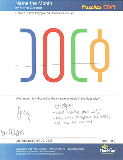
The first puzzle I chose from the list was "Name the Month."  The directions for this puzzle were: "What month is indicated by the strange symbols in the illustration?"  I worked on this assignment with my roommate, Kelly.


This is Kelly's paper.  The strategies she used were: 1.  went through all of the months, 2.  looked for the months with four letters, and 3.  found the months that started with the letter J.


This is my paper.  One strategy that I used was I covered up the top portion of the illustration with my hand (I drew a line on the paper to represent what I hid with my hand).  Once I covered up the top portion, I was able to see clearly the illustration said "July."  The McKim operation that I think is the closest to this strategy is "Finding."  Finding requires you to decide whether or not a figure is concealed in a drawing or number of drawings.


The second puzzle I chose from the list was "The Cat."  The directions were: "How many different triangles can you count in the picture of the cat?"  I did this puzzle with my roommate, Kelly.


 This is Kelly's paper.  The strategy she used was to count all of the individual triangles.


This is my paper.  The strategy that I used was to count each individual triangle one by one.  I first numbered the triangles and then went back and circled them to make sure I counted correctly.  The McKim operation that I used was "Grouping."  Grouping allows you to focus on one common shape and find al of the shapes that match that common shape.


Fact:  We (Kelly and I) actually counted 21 triangles, while the answer on the answer sheet was 20.  We found a triangle that they did not find.


Puzzles from:
http://www.puzzles.com/PuzzlePlayground/Visual.htm